
In today’s digital age, mastering responsive web design is not just an option for businesses in Medford, Oregon—it’s a necessity. With an increasing number of users accessing websites through a variety of devices, from smartphones to tablets and desktops, the need for a website that looks great and functions flawlessly across all platforms has never been more critical. This guide will provide you with practical, user-friendly advice to help Medford businesses excel in responsive web design.
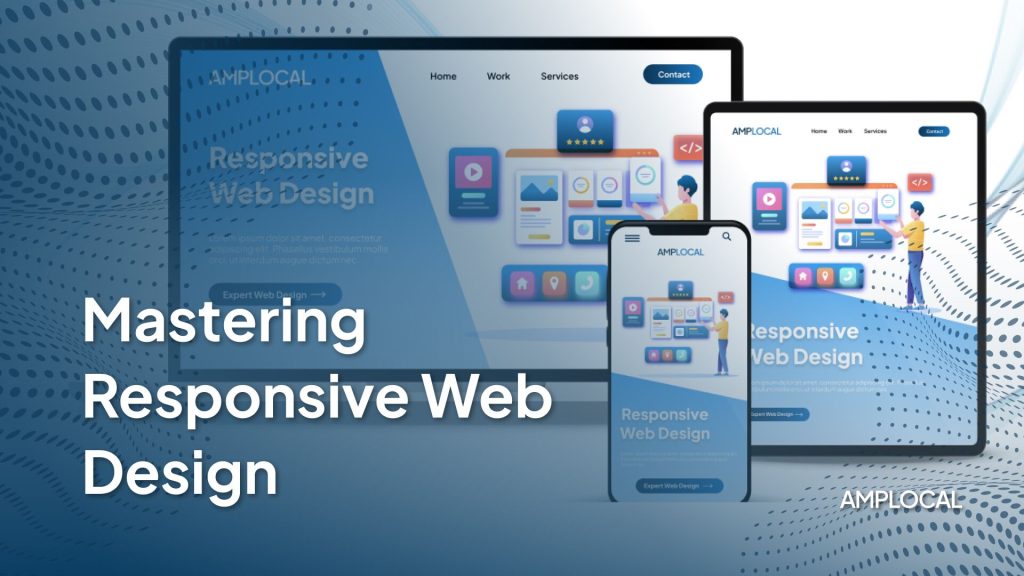
Understanding Responsive Web Design
Responsive web design is a web development approach that creates dynamic changes to the appearance of a website, depending on the screen size and orientation of the device being used to view it. This means your website can offer an optimal experience for users in Ashland, Medford, and beyond, whether they’re on a mobile phone in a coffee shop or on a laptop at home.
The Importance of Flexibility
One of the first steps in mastering responsive web design is understanding the importance of flexibility. This means using fluid grids, flexible images, and media queries to build a website that adapts to any screen size. Not only does this enhance the user experience, but it also improves your site’s SEO—a critical factor for businesses looking to stand out in Medford’s competitive digital landscape.
Prioritizing User Experience
At the heart of responsive web design is the commitment to providing an exceptional user experience. This involves ensuring fast loading times, easy navigation, and interactive elements that engage users from Ashland to Medford. By prioritizing user experience, businesses can significantly reduce bounce rates and encourage longer site visits, which often translate into increased customer conversions.
Key Elements of Responsive Web Design
Mastering responsive web design means paying close attention to several key elements:
- Fluid Grids: The foundation of any responsive design, fluid grids ensure that your layout adapts to the screen size.
- Flexible Images: Images need to be scalable, not just shrinking in size, but also in resolution where necessary.
- Media Queries: These CSS techniques allow you to create a truly responsive experience by applying different styles based on the user’s device.
Mobile First: A Modern Approach
Adopting a mobile-first approach is increasingly becoming best practice in responsive web design. This strategy involves designing for the smallest screen first and then scaling up. It’s particularly relevant for Medford businesses, as mobile usage continues to rise. Starting with mobile allows designers to focus on the core content and functionality, ensuring a seamless experience across all devices.
Responsive Web Design in Action: Medford Case Studies
Consider the success stories of local businesses in Medford and Ashland that have embraced responsive web design. These businesses have seen increased traffic, higher engagement rates, and improved sales figures. By analyzing these case studies, businesses can gain insights into effective strategies and common pitfalls to avoid.
Mastering Responsive Web Design
Techniques and Tools
Mastering responsive web design requires familiarity with various techniques and tools. From CSS frameworks like Bootstrap to design software such as Adobe XD, the right tools can streamline the development process and enhance the final product. Additionally, testing your design across different devices and browsers is crucial for ensuring a consistent user experience.
Conclusion: Your Next Steps
For businesses in Medford, Oregon, mastering responsive web design is a journey that pays off in enhanced user engagement and increased competitiveness. By focusing on flexible layouts, prioritizing user experience, and utilizing the right tools, your business can create a website that stands out in today’s digital landscape.
Are you ready to elevate your business with responsive web design? Start by reviewing your current website’s design and identifying areas for improvement. Consider consulting with a web design professional who can provide tailored advice and support. Remember, in the fast-evolving world of web design, staying informed and adaptable is key to success.
Visit our website for more resources and guidance on mastering responsive web design and to discover how we can help your Medford business thrive in the digital age.
FAQs
- What is the significance of mastering responsive web design for businesses in Medford?
For businesses in Medford, mastering responsive web design is essential as it ensures your website is adaptable and provides an optimal viewing experience on any device, from smartphones to desktops. This adaptability enhances user satisfaction by facilitating easy navigation and interaction with your website, regardless of the device used. As a result, it can lead to increased engagement, higher conversion rates, and improved SEO rankings, helping Medford businesses to stay competitive and visible in today’s digital marketplace.
- How does responsive web design improve user experience for Medford businesses’ online platforms?
Responsive web design dramatically improves user experience by ensuring that visitors to Medford businesses’ websites enjoy seamless navigation and interaction, irrespective of the device used. It eliminates common frustrations such as difficult navigation, slow loading times, and distorted layouts, ensuring content is easily accessible and engaging. By prioritizing the user’s convenience and satisfaction, businesses can foster a positive perception of their brand, encourage longer site visits, and increase the likelihood of conversions.
- What are the crucial components of responsive web design for businesses operating in Medford?
The crucial components of responsive web design for Medford businesses include fluid grids, which allow layouts to adapt to any screen size; flexible images and media, ensuring content looks good on all devices; and media queries, enabling the application of different styles based on the device’s characteristics. Together, these elements ensure a website can provide a consistently excellent user experience, crucial for engaging and retaining customers in the competitive Medford market.
- Why is a mobile-first strategy advantageous for Medford businesses focusing on responsive web design?
A mobile-first strategy is advantageous for Medford businesses because it prioritizes optimizing websites for mobile devices, the primary means through which many users access the internet. This approach ensures that the most critical information and features are easily accessible on smaller screens, enhancing mobile user experience. Additionally, since Google prioritizes mobile-friendly websites in search rankings, a mobile-first approach can also improve a business’s search engine visibility, attracting more traffic and potential customers.
- How can businesses in Medford ensure their responsive web design remains effective and up-to-date?
Medford businesses can ensure their responsive web design remains effective by regularly testing their websites across various devices and browsers, staying informed about the latest design trends and technological advancements, seeking feedback from users to identify areas for improvement, and possibly consulting with web design professionals for expert advice and updates. These practices help businesses maintain a user-friendly, engaging website that meets the evolving expectations of their audience, thereby supporting their growth and success in the digital realm.